Rip off artist
The only formal training I’ve had as a creative (beyond school) was a year long art foundation course at UWE Bristol. At the time, and maybe still, you needed an art foundation qualification to study any art subject at degree level. I thought I might want to do an art degree of some kind so I signed up.
The foundation is designed to introduce creative subjects available to study at degree level, every two weeks you cover a different area - painting, ceramics, illiustration, printmaking, photography, graphic design etc. Strange as it may sound, this was the first time I’d ever heard of graphic design as a discipline or creative artform. Despite being surrounded everyday with designed objects and publications, until this point in my life I hadn’t stopped to consider that every product you encounter has been designed and re-designed, critiqued and approved.
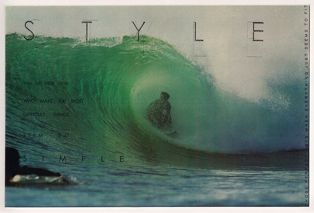
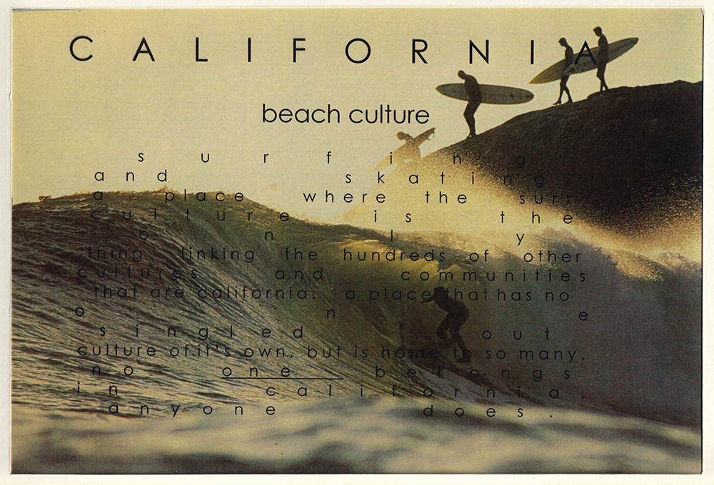
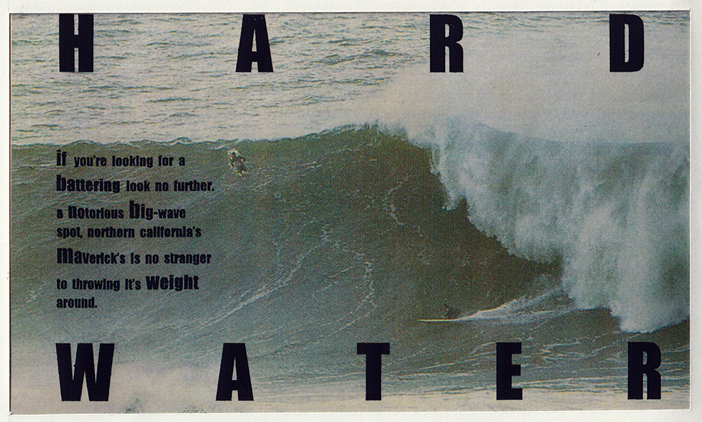
I was an avid (bordering on obsessive) consumer of surfing magazines at the time (late 1990’s), so naturally I attempted to ape my favourite surf rag - Surfer Magazine. I had no idea who the designer was nor any concept of copyright or plagiarism, so I cut out pages and copied words to make my own compositions. One particular edition of surfer that I remember stopping me in my tracks was the issue with Jay Moriarty on the cover, mid-way through an horrific wipeout in a Christ like crucifix pose with his arms outstretched and the surfboard smashing him in the face. The opening spread for the article that the cover shot came from (as I remember) was an expose of Mavericks, a new and terrifying big wave spot in California with the words ‘COLD SWEAT’ set over a huge grey-green wave. HARD WATER (above) was my attempt at making something like the magazine spread.
Little did I know that the designer who was in charge of Surfer at the time was the great David Carson, who I would meet and photograph many years later for Looking Sideways (more on that later of course).
I had no idea how to make these types of layouts, and computer based graphic design was very much still in it’s infancy - no Macbook Pro’s with Adobe Creative Suite! - so I copied the words manually and printed them onto transparent acetate to lay over the images, even sneaking one of my own images into the mix.
Funny to see some themes in these images that still occur in my work now. Futura is still my favourite font :)